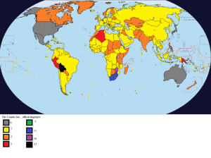
MoverDB.com

May 22, 2016

Top 10 Countries With The Largest Immigrant Populations

Countries by immigrant population

Map created by Stephen Bain via Wikimedia The map above shows countries based on the percentage share of their population who are immigrants. As you can see the numbers vary widely by country. Below we list the top 10 countries with the largest immigrant populations in terms of both relative and absolute numbers. The data […]

Filed Under: immigration 1 Comment

May 18, 2016

Percentage (%) Change In House Prices In England & Wales (2007 vs 2015)

Map created by House.briskat.com The map above shows the percentage change in house prices in 2015 compared to 2007 for England & Wales. 2007 was picked as the starting point because it was the year before the housing bubble “popped.”

Filed Under: Housing Leave a Comment

May 2, 2016

The Outlines of Continents Can Be Visualized By Shipping Routes

Map created by reddit user mattsdfgh; click here for full size With a few notable exceptions, The map above shows the outline of the world’s continents simply by visualizing shipping routes.

Filed Under: Shipping Leave a Comment

May 1, 2016

Which Country Would You Like To Live In (Besides Your Own)?

Map found via reddit; full size here. The map above shows which country in the world people would most want to live in, if there were no barriers preventing them from doing so.

Filed Under: Living 13 Comments

  • « Previous Page
  • 1
  • …
  • 4
  • 5
  • 6

2019 International Container Shipping Rates & Costs

Top 25 International Moving Companies Online

International Moving Costs: 9 Things You Can’t Ignore

Freight Forwarder & NVOCC International Cost & Companies Guide

International Moving Quotes: 12 Questions To Ask Your Mover

Top 10 International Container Shipping Companies

International Removals: Top 13 Companies in The UK

Blog · About · Contact · Privacy Policy · Terms of Use · Facebook · Twitter
Copyright © 2019 MoverDB.com