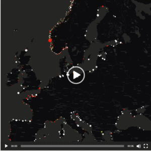
Map created by reddit user PisseGuri82 The map above is a stunning piece of work that shows the when each of the world’s international borders were first defined.
22 Average London Tourist Photos Created By Layering Hundreds of Photos of Iconic London Attractions On Top of Each Other
The photos below by Bill E. Lytton are all amazing visualisations of hundreds of tourist photos of London’s Iconic attractions layered on top of each other. Sort of makes you want to move to London.
Percentage Of Young Adults (18-34) Living At Home In 2005 vs 2015
Map created by the US Census Bureau The map above shows the increase in the number of young adults (18-34) in the United States living at home with their parents in 2015 compared to 2005.
Map Of The Number Of Official Languages Per Country
Map originally posted on reddit The map above shows the number of official languages each country has. As you can see the range is huge, from countries such as the US and Australia who have no official languages (although English is obviously the most widely spoken in both) to Bolivia with 37 (now actually 38). […]
The Only Countries With Economies Bigger Than California
Map found via Reddit The map above shows just how large California’s economy is compared to almost every other country on earth. Depending on how you measure it, only the UK, Germany, Japan, China and of course the United States itself, have larger economies than California’s.
- « Previous Page
- 1
- 2
- 3
- 4
- 5
- 6
- …
- 9
- Next Page »