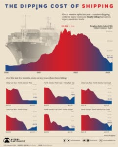
Chart created by Visual Capitalist The chart above shows how dramatically international shipping rates have fallen over the past 3 months. The data is based on the Freightos Baltic Index (FBX) which has fallen a stunning 80%+ since its peak in late 2021. The declines have been especially steep in the past 3 months. Here […]
World Map Showing Only Shipping Routes
The world map above shows only shipping routes and nothing else. The colours represent different ship types including container shipping (yellow), dry bulk (blue), tanker (red), gas bulk (green) and vehicles (purple). You can see an interactive version of the map below:
The Largest Seaport In Europe: Port of Rotterdam Map
Map from Rotterdamtransport.com The map above shows the sprawling Port of Rotterdam, the largest seaport in Europe. However, in terms of container traffic the port doesn’t even crack the top 10 globally.
World Map of Shipping Traffic Density
Map from Marine Traffic via reddit The map above shows the density of shipping traffic around the world. On the whole, areas of high population destiny, also have a high degree of shipping density.
The Outlines of Continents Can Be Visualized By Shipping Routes
Map created by reddit user mattsdfgh; click here for full size With a few notable exceptions, The map above shows the outline of the world’s continents simply by visualizing shipping routes.