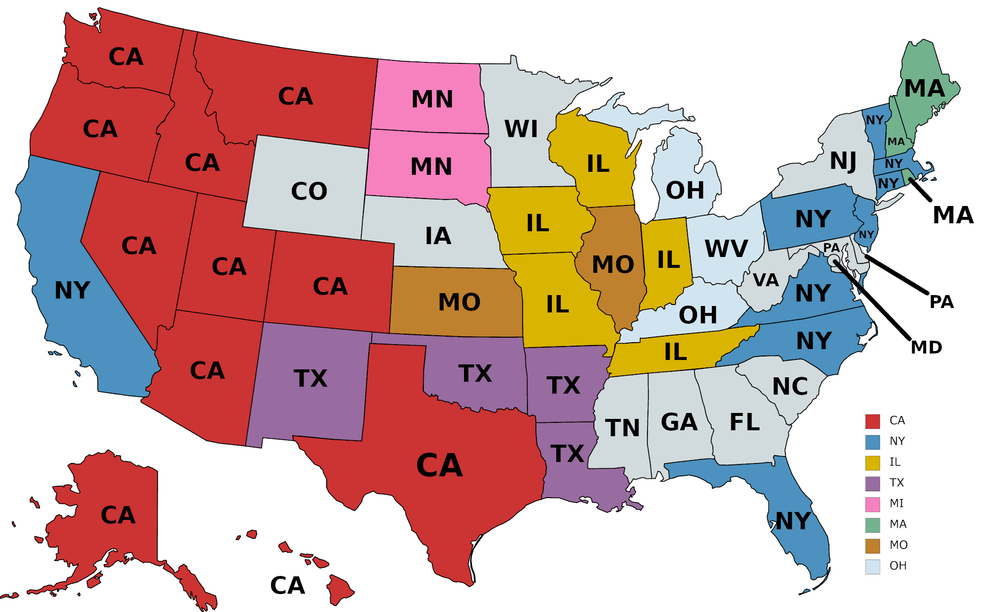
The map above shows the home state of the largest number of residents born out-of-state who now live in that state. Or to put it another way, where Americans move to.
For example, in California there are more New Yorkers who’ve chosen to move there than people born in any other state. Similarly, in Texas there are more people from California than any other state.
Given that California is by far the most populous state (pop 39.5 million), it’s not too surprising seeing it as the largest source of out-of-state residents for the largest number of states.
Florida is interesting because it’s the third most populous state (21.4 million) yet is the largest source of out-of-state residents for only one state (Georgia). This is partly because only 36% of its population was actually born in Florida (21% was born outside the US).
Washington State is the most populous state (13th; 7.6 million) not to be the biggest source of out-of-state residents for any other state.
Reddit user demivus explains how he came up with the map:
Data was sourced from their source at the U of Washington and visualized with mapchart for clean state colors and GIMP for the labels. I colored every state that was the source for two or more other states…except for Pennsylvania, it looks like.
Some interesting facts:
- Technically, DC exports the most residents to Maryland, more than Pennsylvania, but I didn’t include it.
- There are only 1.3 native-born Nevadans for every Californian living in Nevada.
- Likewise, there are only 1.7 native-born New Hampshirites for every Massachusettsan living in New Hampshire.
As expected, many states have several foreign countries whose native-born people outnumber those of the leading American state.
People have identified a typo in the legend, where pink should be MN. Additionally, it looks like I colored Ohio its own color by accident.
The map was actually inspired by this map created by Reddit user Biohzd05 which shows the percentage of native born population:
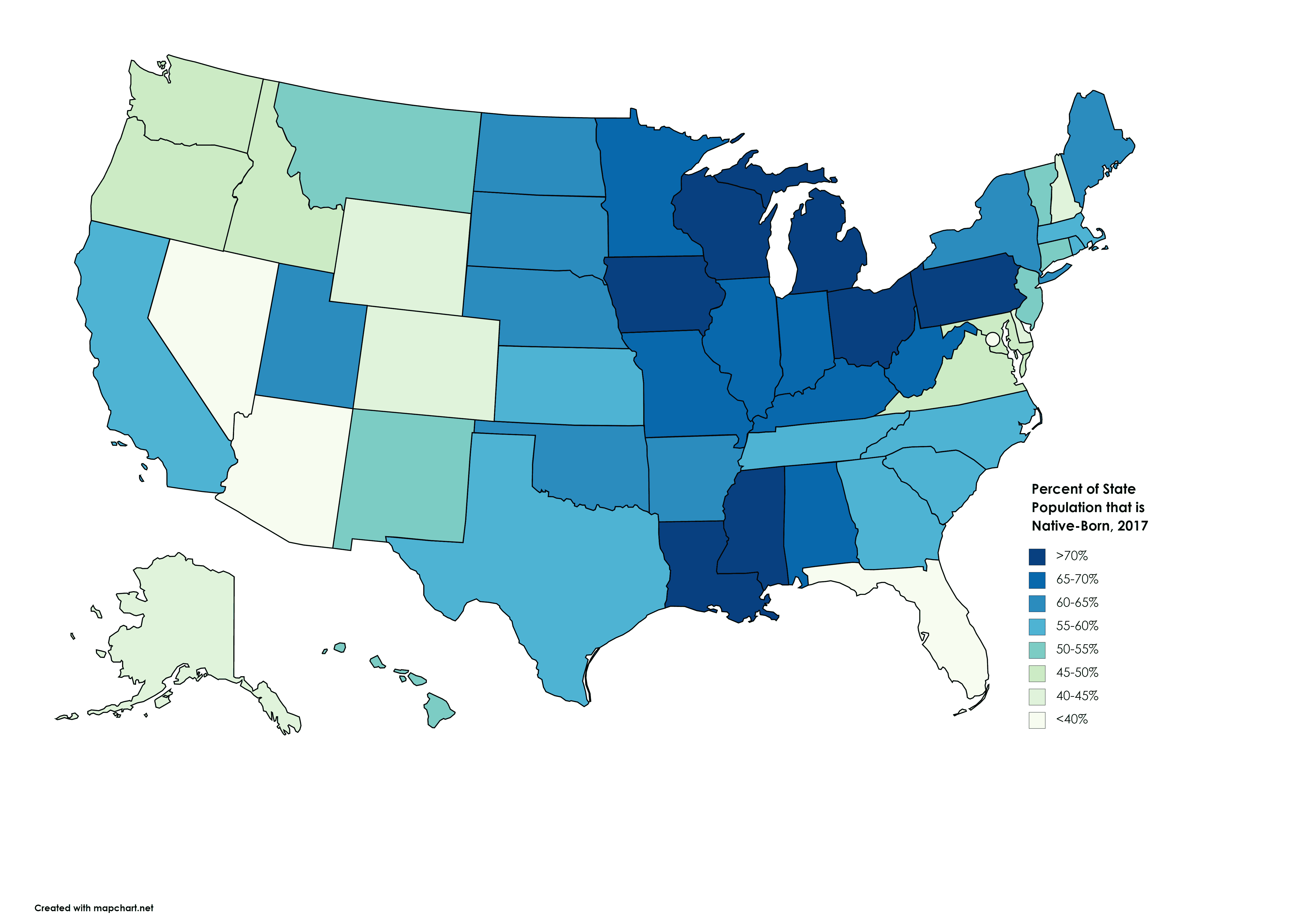
In this case native-born means being born in state. So for example, 78% of people living in Louisiana were born in Louisiana with rest either coming from other states or other countries.
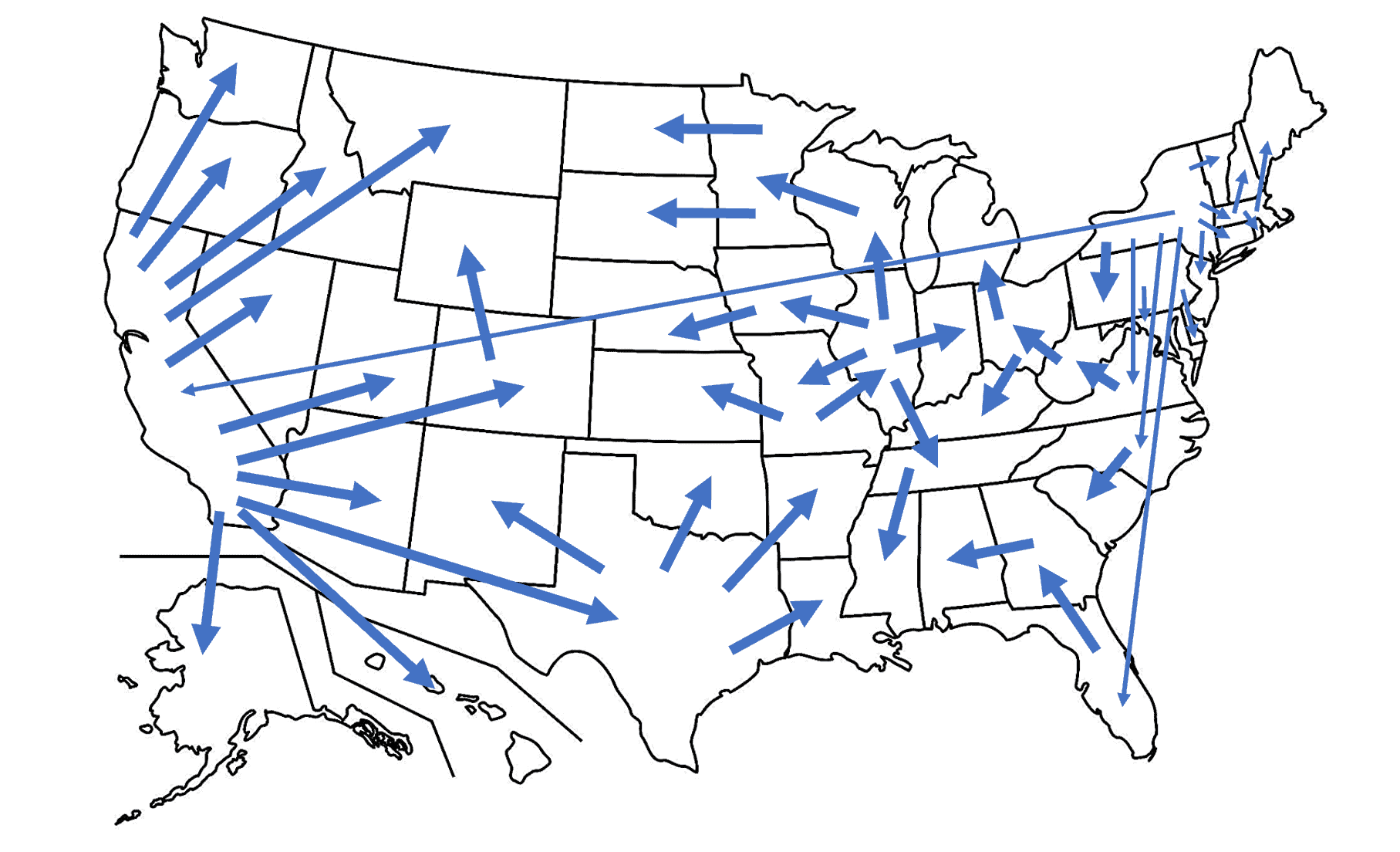
You can also get a better idea of where Amercians are moving using this map with arrows created by reddit user Waja_Wabit.
Have any thoughts? Please leave them below:
anna says
looks like California is the place where everyone wants to live in
LL says
You misinterpreted the map.
jenny says
i was thinking people love to move to NY more but boy i was soo wrong all these years
Ernie says
Unlike the geographic diversity of the states with the largest non-native populations, the states with the smallest non-native populations were more geographically clustered: all of them are in the Southeast and Midwest.
Liza says
Is the pink supposed to represent Minnesota or Michigan? The map reads MN for pink, but the key reads MI for pink.