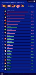
Chart from Visual Capitalist The chart above shows which countries have the largest number of immigrants per capita for countries with a population over 1 million people. It is divided between those in the middle east (all of the top 5) and everywhere else. Below we look at the actual immigrant numbers both in absolute […]
Where Do Millennials Outnumber Boomers In The UK?
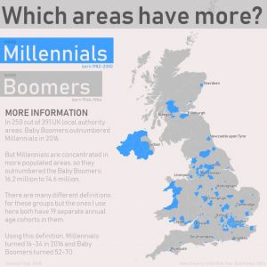
Map created by Alasdair Rae The map above shows which areas of the UK have more Millennials (defined here as those born between 1982-2000) living in them than Baby Boomers (those born between 1945-1964). Surprisingly, Millennials now outnumber Boomers by quite a large margin 16.2 million vs 14.6 million. Yet, because Millennials tend to cluster […]
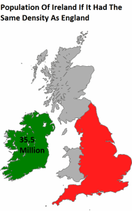
If Ireland Was As Dense As England, Its Population Would Be 35.5 Million
Here are two random facts that show either how densely populated England is and/or how sparsely populated the entire island of Ireland is.
New York State Vs England – How Do They Compare?
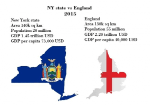
Created by reddit user eivarXlithuania The mapographic above compares New York State and England (note not the full UK). While the two are almost the same size geographically, their population and economies are quite different. Here’s how they stack up with slightly more exact numbers:
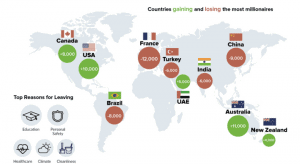
Where Are Millionaires Moving To In 2017?
Map created by Visual Capitalist The map above shows which countries gained and lost the most millionaires in 2016. Surprisingly, Australia was the winner with 11,000 millionaires moving down under and France was the big loser shedding 12,000 millionaires.