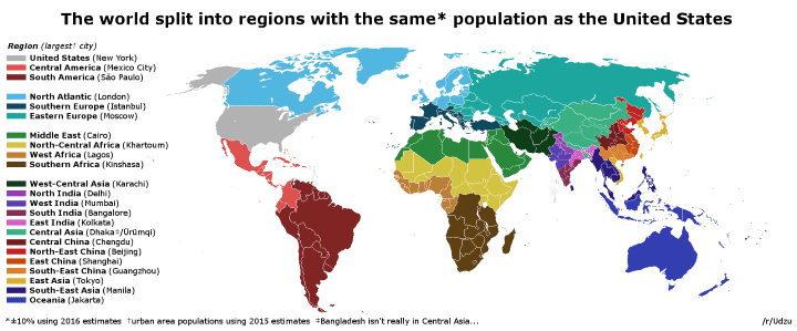
The map above shows the world split into regions with the same (+/- 10%) population as the United States. In total there are 23 regions included on the map, including the US itself.
According to the US Census Bureau, at the time of writing, the US population is 324,424,764 people and world population stood at 7,367,286,530.
The regions (including the largest city based on urban area) are:
- United States (New York)
- Central America (Mexico City)
- South America (São Paulo)
- North Atlantic (London)
- Southern Europe (Istanbul)
- Eastern Europe (Moscow)
- Middle East (Cairo)
- North Central Africa (Khartoum)
- West Africa (Lagos)
- Southern Africa (Kinshasa)
- West-Central Asia (Karachi)
- North India (Delhi)
- West India (Mumbai)
- South India (Bangalore)
- East India (Kolkata)
- Central Asia (Dhaka or Ürümqi)
- Central China (Chengdu)
- North-East China (Beijing)
- East China (Shanghai)
- South-East China (Guangzhou)
- East Asia (Tokyo)
- South-East Asia (Manila)
- Oceania (Jakarta)
The map and data are based on:
Population data is from WDI (for countries) and Wikipedia (for Chinese provinces, Indian states and largest cities). Regions were created using LibreCalc and visualised using GIMP (very low-tech, I know). I tried to keep the regions culturally and geographically coherent, but unsurprisingly had to make many compromises.
Enjoy this map? Then please help by sharing it:

Maak says
Pretty misleading map which lets the US population look larger than it is. Especially the North Atlantic Group is a very bad choice.