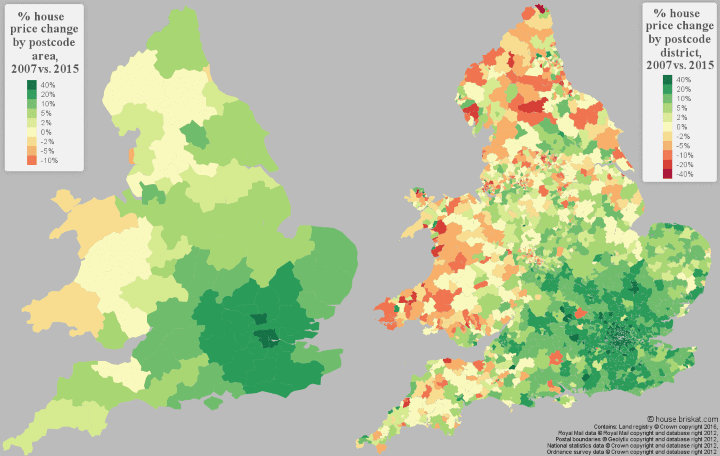
The map above shows the percentage change in house prices in 2015 compared to 2007 for England & Wales. 2007 was picked as the starting point because it was the year before the housing bubble “popped.”
As you can see on a regional level (map on the left), prices in most of areas of the UK have increased from their pre-2007 levels, especially in and around London, where it seemed like the bubble never really popped, just stopped inflating for a year or two.
However, if you break the map down by postcodes (map on the right) you can see this simple pictures hides a huge divergence of outcomes. In central London prices have appreciated much more than 40%, whereas in some northern postcodes prices have fallen by as much.
You can really drill down into the data on http://house.briskat.com/ , where you’ll find a fully interactive map with data going back to 1995, find out trends for your postcode and even breakdown by tenancy type, housing type etc.
If you found this post interesting please help us by sharing with a friend. What do you think about housing in England and Wales? Leave your comments below:

Martin Lunnon says
Once you look at the figures by small area, you have to ask closely what’s being measured. Are these the prices of the same houses, or has the mix of housing in the area (or the housing being sold in the area) changed over the period? For instance consider a postcode that covers a large attractive village. In the earlier year most of the property sold might well be substantial detached houses. Now consider that a substantial development of starter homes was built there and most of those were sold in the later year. This might depress the average price of property sold in the village very considerably between the two years.
Andy Aitken says
Would love to see this map updated to 2021.